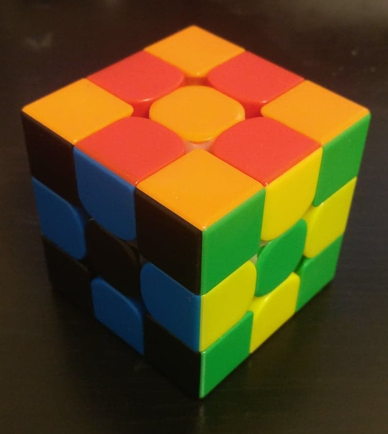
My Color Scheme
I get questioned about my color scheme a lot, so I figure I'd put this in one place online to maybe reduce the questions. Probably won't change a thing, but worth a shot.
I bought my very first Rubik's Cube at a local Borders store (rest in peace), and all they had were cubes styled with Detroit Red Wings pictures on each of the six sides. I solved on this for a while, but with three of the sides being black with different logos on them, I needed something better to get faster. Rather than buy a new cube, one of my friends in high school that also cubed told me about CubeSmith stickers (also, rest in peace), and so I ordered some replacement stickers from them. He also mentioned that I should use a Japanese color scheme to be edgy or something.
Well, turns out that high school me doesn't understand how symmetry works. I actually put the colors on with two opposite sides swapped, so I actually used the same color scheme as Mike Hughey. When I first learned about DIY speedcube kits, I decided to buy the white cubes for a couple of reasons: they looked cooler to me and they were typically cheaper than black. I think old white cubes are actually just uncolored/primary, so they ended up a dollar or two cheaper, typically. So I bought my first DIY kit and just stickered it with the black stickers it came with. Apparently, when I started speedcubing up again in 2013, white stickers on a white cube were totally normal, but that was not the case in 2008.
But anyways, that's how I ended up with my current color scheme. I use it for all events except FMC, as I like to be able to check if my scramble matches the picture easily. It actually has a nice side effect of my cubes being super recognizeable at competitions, and also acts as an anti-theft mechanism.